¶ Step-by-Step Instructions for Adding Widgets to Your Dashboard
¶ Step 1: Accessing the Menu
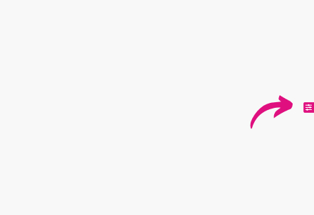
- Begin by locating the Menu button in the dashboard interface. This button opens a menu containing various settings and customization options for your dashboard.
- Click the Menu button to open a drop-down menu with options like filters, widgets, and general dashboard settings.
¶ Step 2: Selecting the Widget Option
-
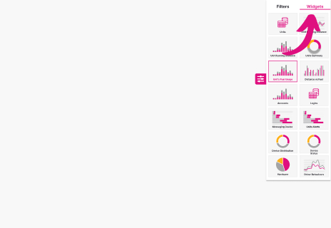
Once the menu is open, you will see two main options:
- Filter: This option allows you to apply filters to refine the data displayed on the dashboard. Filters can be set to view specific time periods, unit types, or other data parameters. Filters will only be applied to those widgets where the global filter checkbox is checked.
- Widget: This option enables you to add new widgets to your dashboard. Widgets allow you to visualize data in various forms such as charts, tables, and metrics panels.
-
To proceed with adding a new widget, select the Widget option.
-
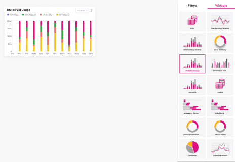
Upon selection, a list of available widgets will be displayed. Each widget type corresponds to a different data visualization method, such as bar charts, line graphs, pie charts, or custom data grids.
-
Consider the type of data you need to display, and choose a widget that best fits your analytical requirements.
¶ Step 3: Choosing a Widget
-
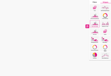
After selecting the Widget option, a list of available widgets will appear. These widgets may include different types of charts, graphs, or tables, depending on the system’s configuration.
-
Browse through the widget library and select the one you wish to add to your dashboard.
- Chart Widgets: Display visual trends using bar, line, or pie charts, great for monitoring metrics over time.
- Data Table Widgets: Present structured data in a grid or table format, ideal for detailed data analysis.
- Metric Widgets: Show specific key performance indicators (KPIs) in a concise format, such as numbers or percentages.
- Custom Widgets: These allow advanced users to build tailored widgets based on specific data sets and visualization needs.
-
Click on the desired widget to move forward with configuring it.
-For more details about each widget, please refer to the link: Dashboard
¶ Step 4: Configuring the Widget
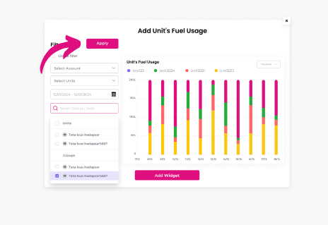
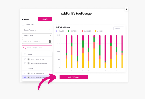
Once you have selected a widget, a configuration window will pop up. This window will allow you to define specific settings for how the widget will behave and display data. Follow these steps to customize the widget based on your requirements:
-
Global Filter:
- In the Global Filter section, allows you to apply filters to refine the data displayed on the dashboard. Filters can be set to view specific time periods, unit types, or other data parameters. Filters will only be applied to those widgets where the global filter checkbox is checked.
- For example, you might set a global filter to display data by using filter from dashboard.
-
Select Account:
- Choose the Sub-Account from the drop-down menu.
- The data presented in the widget will correspond to the account you select.
-
Default Date Range:
- Set the Default Date Range for the widget, such as showing data from the last week, last month, or any custom date range that fits your reporting needs. This is especially useful for widgets that track time-sensitive data, such as performance metrics over time.
- You can also specify dynamic date ranges like "Last 7 Days" or "Last Quarter" to automatically update the displayed data as time progresses.
-
Search Units/Groups:
- You will be presented with two lists: Units and Groups. Units represent individual entities, while Groups are collections of units organized based on specific criteria, such as geographic region or functional team.
- Use the search bar above the lists to quickly locate specific units or groups.
- As you type in the search bar, the list below will filter to show only the units or groups matching your input.
-
Selecting Units/Groups:
- After locating the units or groups you wish to include in the widget, you can select them by checking the corresponding boxes. This allows you to create a widget that presents data for multiple units simultaneously, offering a comprehensive view.
- In some cases, certain widgets may limit you to selecting only a single unit for more focused analysis.
- If a "Select All" checkbox is available, you can select all units within a group or account by checking this option.
-
Applying Filters:
- After completing the necessary configurations, click Apply to preview the widget with the applied settings and filters.
- The preview window may include additional tools for interacting with the data, such as:
- Zoom In/Out: Allows you to zoom into specific data points or zoom out for a broader view.
- Hand Tool: Enables you to pan across the widget for a closer examination of specific data areas.
- Home: Resets the widget view to its default configuration.
- Menu: Accesses more widget settings for further customization.
¶ Step 5: Adding the Widget
- Once you're satisfied with the configuration and preview, click the Add Widget button. This will finalize the setup and add the widget to your dashboard.
- The widget will now display real-time data based on the configurations you set, including filters, units, and date ranges.
¶ Step 6: Managing Widgets on the Dashboard
After adding the widget to your dashboard, you have several options for managing its appearance and functionality:
-
Adjusting the Widget Size:
- Resize the widget by dragging its edges. This helps you control how much space the widget takes up on your dashboard.
- Larger widgets are ideal for more detailed visualizations like complex graphs, while smaller widgets are suitable for simple metrics or overviews.
-
Moving or Deleting Widgets:
- Each widget comes with a three-dot menu in the top-right corner (the "more options" menu). From this menu, you can:
- Delete: Remove the widget from the dashboard if it’s no longer needed.
- Move: Reposition the widget by dragging it to a new location on the dashboard.
- Edit: Reopen the widget configuration settings to modify filters, units, or other details.
- Each widget comes with a three-dot menu in the top-right corner (the "more options" menu). From this menu, you can:
-
Rearranging Widgets:
- You can drag and drop widgets anywhere on your dashboard, allowing for full customization of your layout. This lets you prioritize the widgets most important to your day-to-day operations.
-
Interactive Features:
- Some widgets come with interactive options like drill-downs, where clicking on a specific data point reveals more granular details. Use these features to gain deeper insights into your data.
- Some widgets come with interactive options like drill-downs, where clicking on a specific data point reveals more granular details. Use these features to gain deeper insights into your data.
¶ Key Features of Widget Customization
- Multiple Unit/Group Selection: Choose multiple units or groups for comprehensive data comparisons across different teams or regions.
- Search Functionality: Quickly locate units, groups, or accounts using the search bar, saving time when configuring complex widgets.
- Global and Specific Filters: Apply both global filters (affecting all data in the widget) and specific filters (narrowing down data for particular units or time periods).
- Widget Customization: After adding a widget, resize and move it to fit your dashboard's layout, ensuring the most critical data is always in focus.
By following these steps, you can create a customized dashboard that aligns with your unique data visualization and analysis needs.
.